Online fundraising best practices that simply don’t work
Should you follow “best practices” when designing your online fundraising campaigns?
Not according to a presentation I gave yesterday with Tim Kachuriak at the Marketing Sherpa Optimization Summit in Denver.
Our presentation explained how we optimized The Heritage Foundation’s online fundraising pages by directly questioning longstanding online fundraising best practices.
In fact, as MECLABS president Flint McGlaughlin said at the summit, “best practices on the internet are typically pooled ignorance.”
Tim and I posed a direct challenge to online fundraising best practices:
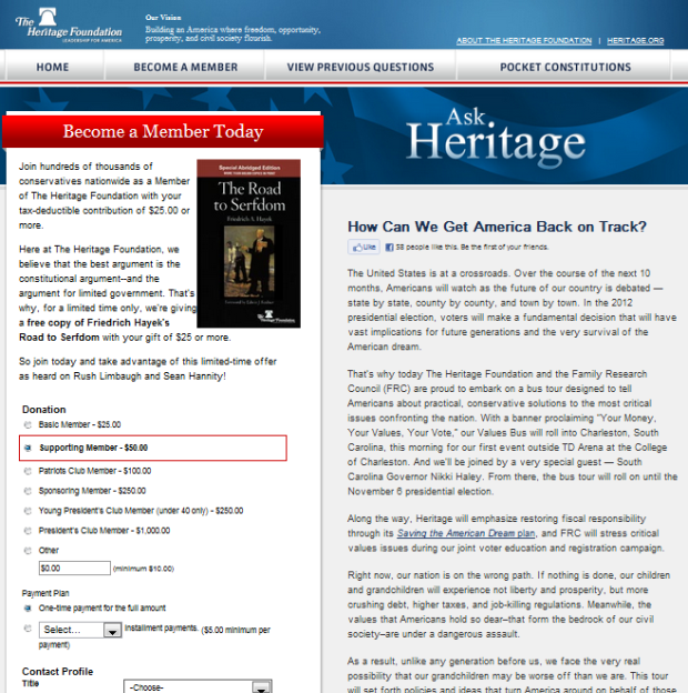
- We boosted average donation without adding incentives or premiums. Instead, we simply asked for larger gifts.
- We improved e-mail click-throughs by not asking for a donation in our fundraising emails.
- We increased online revenue by adding a second, separate call to action on our donation page.
- We added more e-mail signups by engaging users in a conversation and not asking them to sign up on the homepage.
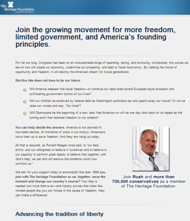
- We debunked a key branding myth by running an effective, unbranded fundraising microsite.
- We demonstrated that ** placing the call to action below the fold **can increase conversions.
We closed our presentation with this video showing how not to create a culture of optimization.
What best practices have you found to be faulty?