When I can’t read your e-mail on my phone, it’s your problem
If I give up reading the promotional e-mail you sent me because I have to squint to make out what it says on my phone, that’s a problem.
If I abandon your website because I have to keep zooming in and out on my phone to navigate, that’s a problem.
But these aren’t my problems: they’re yours.
Every e-mail and web page you create must be optimized to work on whatever device your users happen to be using. That means you need copy and designs that are fully usable both on desktop computers and, without pinching and zooming, on mobile devices like iPhone or Android phones. Sure, modern phones can display just about any page you throw at them. But that’s not enough.
Below are some examples to visually demonstrate what I mean.
Send e-mails to people, not to their desktop computers
If you’re trying to reach me–or any customer–by e-mail, you had better be sure I can read it wherever I am. Don’t design it to work only on my desktop computer.
Here’s an example from Zipcar that I couldn’t read on my iPhone:

The font in this message is very small and hard to read, except for the “last chance” graphic and the “tick tock” headline.
So why doesn’t it work? Because this message has a fixed-width design, a mobile device like the iPhone will aim to fit the entire width of the document on the screen, scaling down images and text to fit. It’s formally functional on a mobile device in that it renders faithfully to the original, but that’s actually the problem. The original is designed for someone with 540px or more of available horizontal screen real estate, but iPhones and Androids are in practice far narrower (iPhones are, for practical purposes, 320px wide). An e-mail designed this way puts the design before effective communication.
Compare that message to this one:

In this case, we used a responsive, flexible-width design to ensure the message is legible on all devices. We also stripped out most images and formatting, so it even works nicely on older Blackberries, while in Outlook or Gmail it renders as a normal e-mail might.
Design web pages that work on any device
The same rule applies to web pages. Consider ESPN.com, rendered in desktop format on an iPhone:
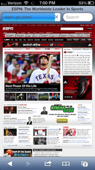
I know, right? It’s fully functional in the sense that it can be operated on an iPhone. But good luck finding what you want, clicking the right item, etc. There’s something about the Texas Rangers, but that’s about all I can read on the site.
To their credit, ESPN automatically sends mobile users to their mobile-optimized version, with text that’s legible, buttons intended for tapping with a finger rather than clicking with a mouse, and so forth:

Which version would you rather use on your phone?
Don’t ignore 12 percent of your customers
Mobile is something online marketers have to get right. Growing portions of web traffic–nearly 12 percent by one count, and certainly higher for some audiences–is driven by people using mobile browsers. You lose a lot when you send people messages they can’t use and promote sites they can’t read.
For a quick introduction to this topic, Smashing Magazine has a whole section on responsive web design, including this article on responsive e-mail templates. These articles on design patterns for mobile are also helpful.
What have you done to optimize your online marketing for mobile users? Tell me in the comments or at @nathanielward.